MALLORY MICHAEL

SENIOR; GRAPHIC DESIGN; COLLEGE OF ARCHITECHTURE, DESIGN, AND CONSTRUCTION
GUSTAV HOLST POSTER:
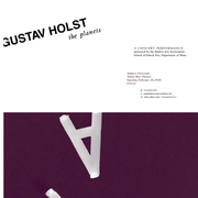
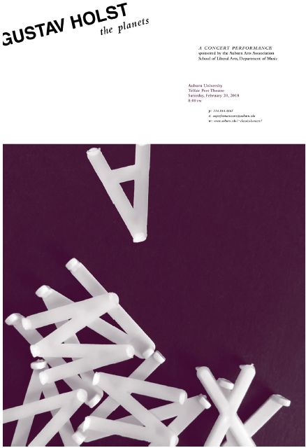
For this project, we were assigned an unknown piece of music to interpret into a 2-D form visually using only shape, form, line, and typography. We then used the image to create a poster promoting a concert of the selected performance. Hierarchy was first established in black and white before applying a maximum of two colors.

Graphic Design | Typography
Poster
Acrylic on MDF
17” x 11”
2018
Last Updated: July 24, 2018

